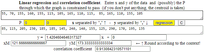
55, 70, 155, 160, 155, 115, 105, 165, 110, 115, 85, 165, 110, 155, 105
85, 115, 205, 230, 185, 185, 145, 240, 140, 155, 125, 290, 170, 195, 135
I put (0,0) as "fixed point". I get (rounding): y = 1.42 x, correlation coefficient = 0.913.
|
First example.
I want to study the link between
the DA (A: air) distance in a crow line from Genoa to other places in Northern Italy and
the DS (S: street) distance along the road.
I collect data relating to the minimum road distances from Genoa of the provincial capitals of Piedmont, Lombardy and Veneto
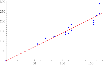
and those relating to the distances in the crow flies: 55, 70, 155, 160, 155, 115, 105, 165, 110, 115, 85, 165, 110, 155, 105 85, 115, 205, 230, 185, 185, 145, 240, 140, 155, 125, 290, 170, 195, 135 I put (0,0) as "fixed point". I get (rounding): y = 1.42 x, correlation coefficient = 0.913. | |
How to graphically represent what was obtained: I put in WolframAlpha:
plot {(55,85);(70,115);(155,205);(160,230);(155,185);(115,185);(105,145);(165,240);(110,140);(115,155);(85,125);(165,290);(110,170);(155,195);(105,135);(0,0);(170,170*1.42046)} color blue
I copy the image in Paint (or a similar application) and I draw the line (0,0)-(170,170*1.42046).
It's easier to do everything with this script.
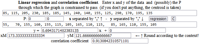
Note. The correlation coefficient would be the same if you took DS as x and DA as y. The regression coefficient is instead not 1/1.4204604646317327 = 0.703997... but 0.694317...:
|
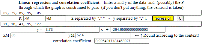
Second example. A sample of "ideal gas". y: approximate values (with some units of uncertainty) of the temperature in degrees Celsius; x: corresponding pressure values (in mm of mercury). x: 65, 75, 85, 95, 105 y: -21, 18, 43, 95, 127 I get (rounding): y = 3.73 x − 264.65 (264.65 is close to −273), correl. coeffic. = 0.995. | 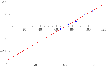 |
How to graphically represent what was obtained: I put in WolframAlpha:
plot { (65,-21),(75,18),(85,43),(95,95),(105,127),(0,-264.65),(120,3.73*120-264.65) } color blue
I copy the image in Paint (or a similar application) and I draw the line (0,-264.65)-(120,3.73*120-264.65). It's easier to do everything with this script.
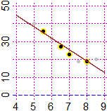
Third example.
In an experiment on the growth of wheat during the winter, the average temperature (in °C) of the soil at a depth of 8 cm (x) and the days necessary for sprouting (y) are recorded.
Is there a relationship between soil temperature and sprouting time? Can we mathematize this relationship?
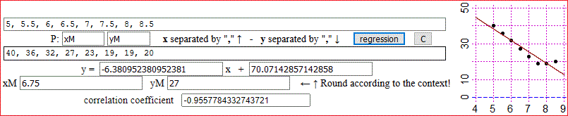
x: 5, 5.5, 6, 6.5, 7, 7.5, 8, 8.5
y: 40, 36, 32, 27, 23, 19, 19, 20
We can roughly express the relationship with the function: y = −6.4·x + 70 (if x ≤ 8).
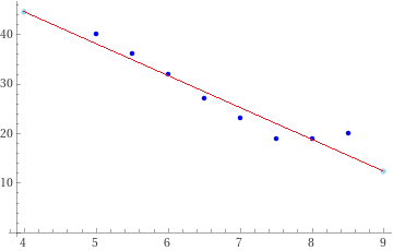
How to graphically represent what was obtained: I put in WolframAlpha:
plot { (5,40),(5.5,36),(6,32),(6.5,27),(7,23),(7.5,19),(8,19),(8.5,20),(4,-6.4*4+70),(9,-6.4*9+70) } color blue
I copy the image in Paint (or a similar application) and I draw the line (4,-6.4*4+70)-(9,-6.4*9+70). It's easier to do everything with this script.
To associate the linear correlation with a measure of accuracy it is convenient to use WolframAlpha:
Result: -0.955778 p-value: 0.000209086 What is p-value?
It is the probability of obtaining (with a given amount of data) a given correlation coefficient under the assumption that the two variables are totally uncorrelated (ie that the correlation coefficient was actually 0).
In our case we got 0.0209086%: there is a very low probability that the data is uncorrelated.
A p-value no greater than 5% is often assumed as the conventional limit for the possible existence of a correlation.
The p-value (also used in many other situations) does not, in itself, establish probabilities of hypotheses; rather, it is a tool for deciding whether to reject the tested model. For further information see en.wikipedia. If I have less data (see the graph on the right), I can obtain a greater correlation coefficient but at the same time have a much greater p-value: the probability that there is no statistical link between the data has greatly increased:
|  |